Uber App Redesign


Background
Uber is a mobile rideshare app that provides various modes of transportation to its users. However, the user interface for Uber can sometimes be unituitive. The goal of this project was to implement feedback on the Uber app to create some quality-of-life features to better the user experience. This project was an original idea.
Duration: December 2022 - January 2023
Problem: Uber users are not having a clear, informative experience when using the app
Goal: Redesign the Uber app to implement quality-of-life features to improve the overall user experience
Role: UI/UX Designer for Uber App Redesign
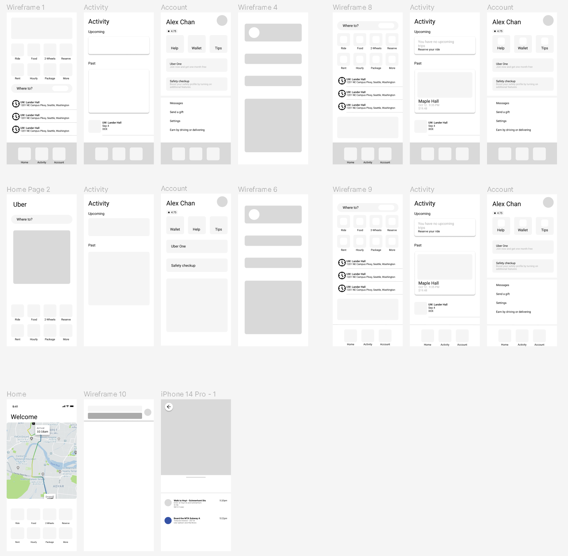
Responsibilities: Market and app research, paper and digital wireframing, low and high-fidelity prototyping, accounting for accessibility, and iterating on designs
Research
I conducted market research on the Uber app to identify user pain points that would provide insight on what I could add to the current user experience. The main pain points I found for the user interface were:
Location conflicts - users were unable to select or be picked up by the location they marked
Clarity - users may be unclear about which ride option to select, and may end up picking the wrong one
Design Principles
Gathering the insights from the market research, I decided on three design principles to guide my design choices, that being:
Users should have all the information they need to select a ride
Users should have a simple, intuitive interface to work with
Users should have accessibility options available
Design System
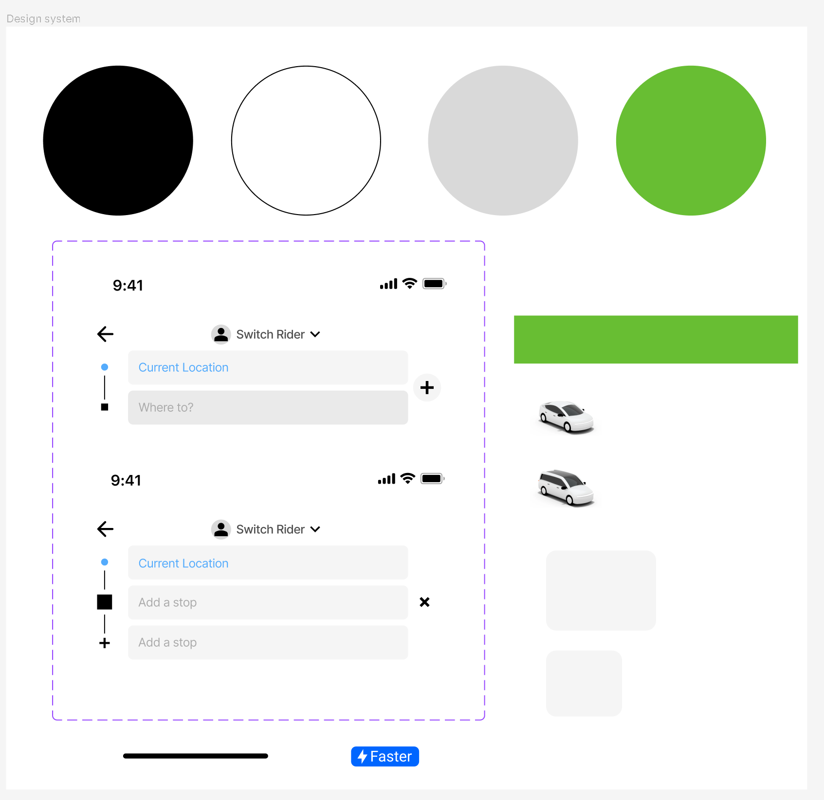
Afterwards, I then created a design system that closely matched Uber’s current design system. I used Roboto for the font as it is clear and easy to read, and for icons I used the Material UI library.

Final Product
These are the current mockups for the Uber redesign project. With additional usability testing, I am looking to go back and iterate more on my design.
Home Screen
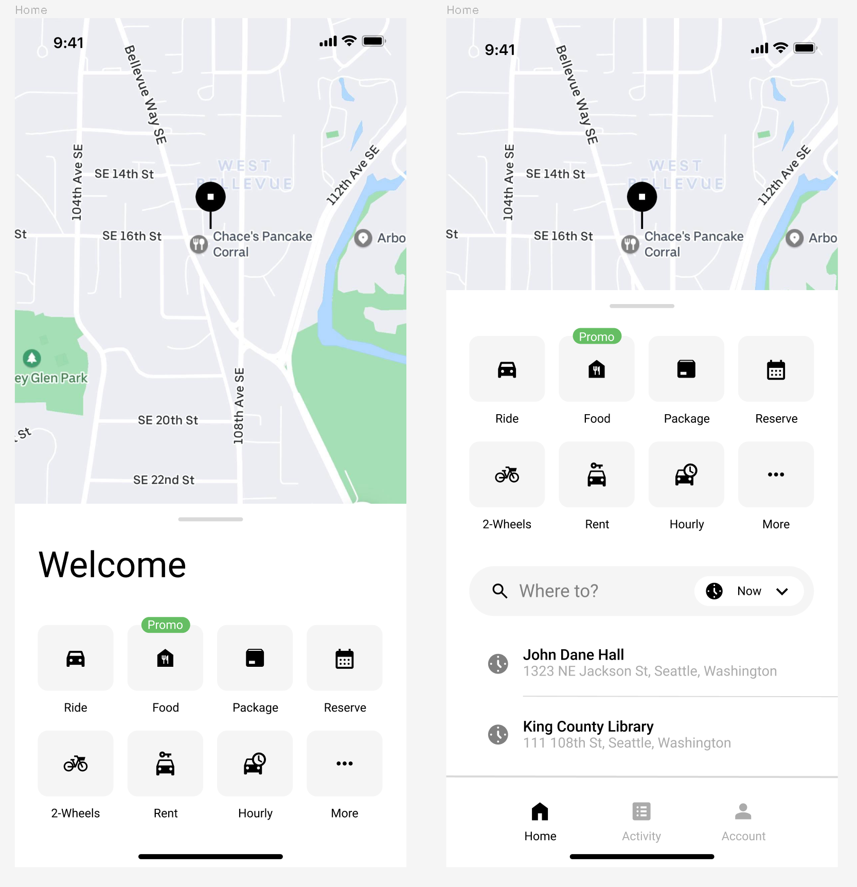
I redesigned the home screen to be more informative for the user by providing their current location with the map Uber uses, while also retaining parts of the current Uber home screen and putting them on a bottom pane. That way, users will automatically know where they are when they open up Uber. When tapping on the pane, it will slide up to show more features such as previous locations or the navigation bar to switch between the home page, activity, and account.

Stop Selection
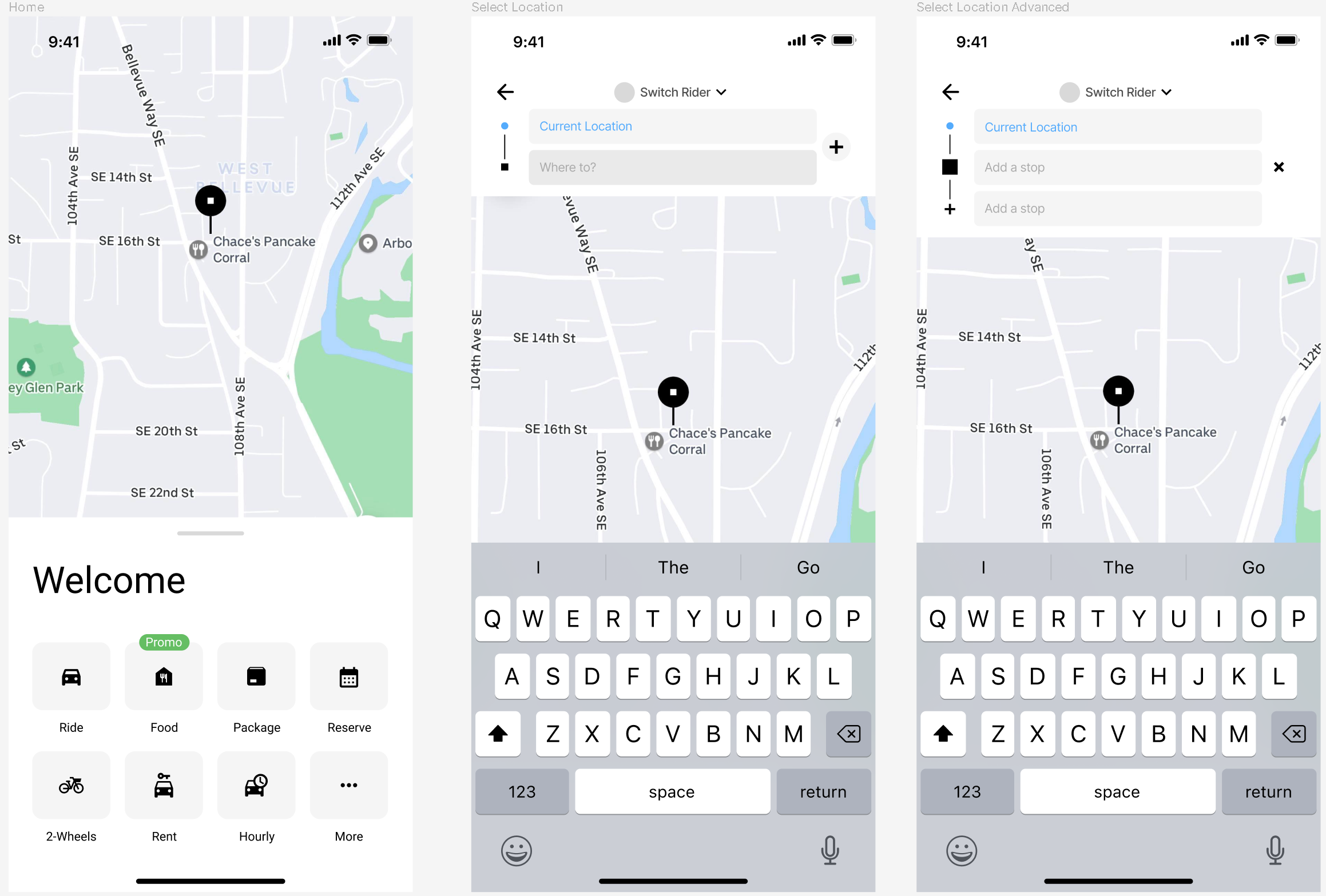
Upon selecting that they want a ride, users will be taken to an input field and map where they can input where they are going and coming from. I added the map to this screen as well so that users would have an easier time selecting where they need to go.

Ride Confirmation
After selecting their destination, users will then need to select their ride option based on what best suited their needs. I added the descriptions from the current Uber design onto the initial screen, as it provides more clarity to the user about what type of ride they are expecting. I also changed the confirmation button color to green to highlight it and make it more accessible for users.

Reflections
What I learned:
Throughout this project, I learned a lot about user interface design and all the considerations and decisions that go into doing it. Taking the time to implement my own changes while also sticking as close as I could to the Uber brand was more challenging than I expected, but ultimately rewarding. I also originally started this project wanting to do a complete overhaul of the Uber app. However, after a couple weeks of research I rescoped my idea into just focusing on the rideshare portion. If I were to revisit this project, I would:
Usability testing - if given the opportunity, I would conduct usability testing on the current iteration to make sure that the design was addressing user needs.
Iteration - now that I have a better understanding of user interface design, I would try to redesign more screen on the Uber app rather than just the rideshare portion.
Next Steps:
I would create a clickable prototype and perform usability testing to refine the design and to test how the user would navigate through the app. With those insights, I would ideate more screens from the Uber app and conduct more research to refine my understanding of user pain points and needs.
Thanks for reading!
