ArtGo: an app for museum-goers
Background
For the first project of the Google UX Design Professional Certificate Course, I was tasked to create a mobile app based on the prompt of designing an art gallery app for users. Due to the nature and constraints of this project, I had to base my design on a fictional organization and product. However, I utilized the UX Design Process throughout the entire project. I came up with ArtGo, an app designed to track exhibits based on location and can save exhibits for the user to read whenever they want.
Duration: June 2022 - August 2022
Problem: Museum-goers may not have the freedom to see exhibits whenever they want due to constraints
Goal: Design a mobile app to track museum exhibits so that users have a better museum-going experience and are able to read exhibits they may miss
Role: UI/UX Designer for ArtGo
Responsibilities: Conducting interviews, paper and digital wireframing, low and high-fidelity prototyping, conducting usability studies, accounting for accessibility, and iterating on designs
Research
I conducted user research and performed a competitive audit to learn more about my target audience and to find areas in current museum apps that ArtGo could improve on. Here are the user pain points I discovered:
Time - users did not have enough leisure time to explore museums freely
Interest - users may not necessarily be drawn to go to museums of their own volition
Limited in-person capabilities - due to the pandemic, users may be restricted for in-person attendance
Lack of information - some museum apps are not as informative as others, which hinders accessibility
Personas
I came up with some user insights and used them to create personas that best reflected the target users. These personas helped guide my design choices and made sure that my ideas were feasible. Here is Jonathan, a third-year college student that is interested in art but does not have the time to explore his interests. And we have May, a website manager for her local museum that wants to garner more museum publicity after the pandemic lowered profits.
Initial Design
I ideated with paper and digital wireframes to focus on the user pain points I found in my research and personas. I focused mainly on the user flow and navigation of the design, making it accessible and informative. I then worked on making the low-fidelity wireframes into a clickable prototype.
Usability Testing
I conducted an unmoderated usability test with five participants comprised of young adults still in college and working adults. The main goal of the usability testing was to find areas of improvement in the design as well as test out usability features. The main findings were as follows:
Users needed a clearer button layout because they were unsure what the buttons did
Users needed a way to notice certain features of the app that were not being used
Users found the video function redundant
Final Product
Taking in the feedback from the usability testing, I created high-fidelity mockups. I added more labels and color separation to each page so that users would understand each area of the app.
Exhibit Screens
When entering the home screen, users will see a list of exhibits sorted on recently viewed, nearby, and bookmarked. Upon clicking an image, users will be taken to a page containing more information about the exhibit as well as external resources they can look at if they want to. The page includes a toolbar that allows them to turn on an audio reading of the page, bookmark the page, or purchase a ticket for that exhibit.
Ticket Purchase
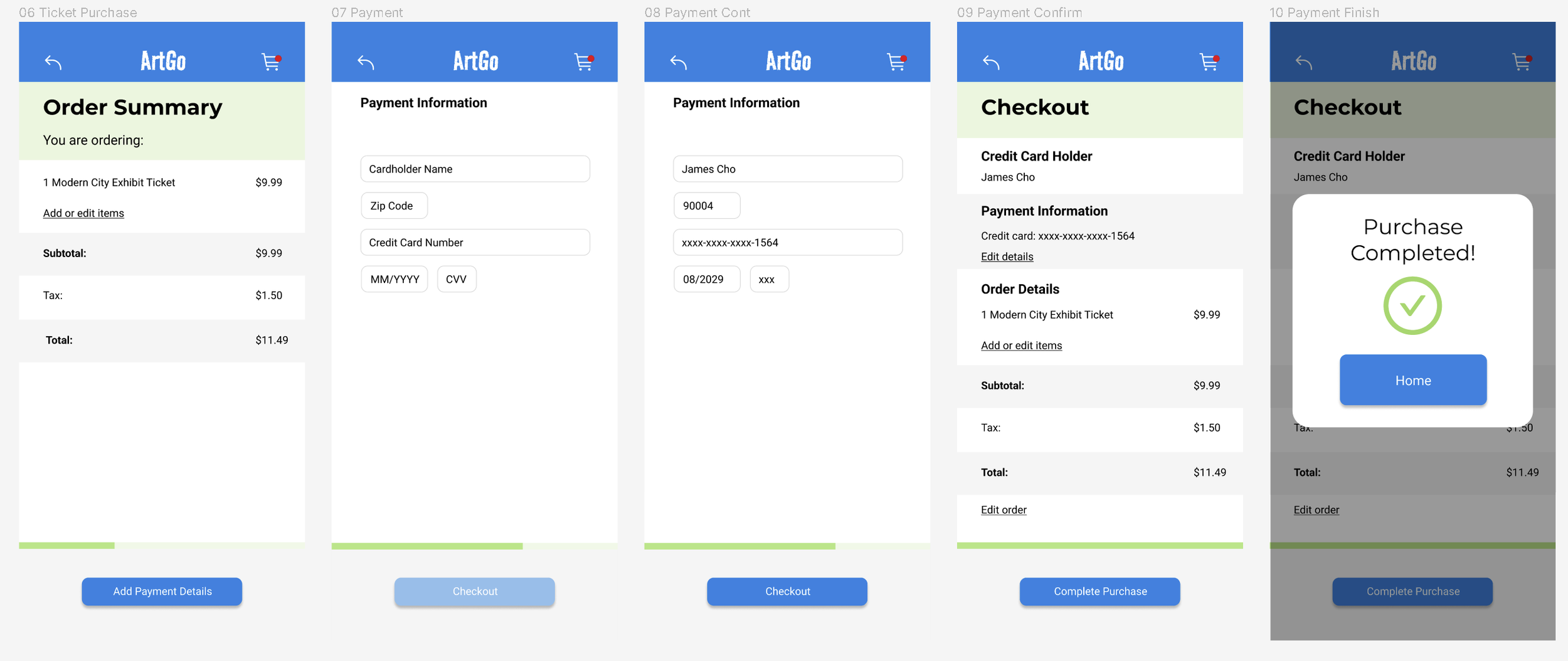
Upon navigating to the ticket purchase screen, users will see an order summary of how many tickets they are purchasing, as well as the subtotal, tax, and total. They can enter their payment information and after doing so, are taken to a payment confirmation page. Once complete, a notification will pop up.
High-fidelity prototype
After completing the mockups, I linked them together to create a clickable prototype, following the same flow as my low-fidelity wireframes.
Reflections
What I learned:
Throughout this project, I learned how valuable user research, market research, and usability studies were to improving designs. The prompt I chose was challenging not only because of the constraints, but because it was a different area of design that I had not taken on before. With the research and usability studies, I was able to guide my design choices by outlining the user pain points and building my designs off that. If I were to do this project differently, I would:
Conduct more user research - more user research would help solidify the target audience’s needs and provide more user pain points that my design could cover
Usability testing - if given the opportunity, I would have conducted more usability testing on the low-fidelity prototype to make sure that the design was addressing user needs before moving on to the mockups.
Next Steps:
I would perform another round of usability testing on the high-fidelity prototype to refine the design and to test how the user would navigate through the app. With those insights, I would ideate more potential screens and layouts of ArtGo as well as conduct more user research to make sure I was addressing user needs.
Thanks for reading!


